Hey! Have you heard? It’s time to vote on a Sewcialist Logo! We had 6 entries that met our design criteria – Now it’s your turn to pick your favourite! Goose flesh! I have Goose flesh! Please consider the following before you cast your vote:
We asked each designer to design an emblem that…
- Relates to sewing and the social nature of sewcialists
- Is modern, simple, recognizable and memorable
- Is useable in black & white as well as in color
You can read the rest of the requirements on the Sewcialists.org site. On this site, you can also find the rest of the Jury Blogs. You are allowed one vote per jury blog. (The Jury itself will not be voting.)
When you vote on our blogs, please make your vote very clear, typing in the # of the entry and the designer’s name.
Included before each design is a portion of the designer’s cover letter to give you context.
Voting closes on May 8th at midnight Eastern time in the United States.
Entry #1- Bev- Here’s what she said about her design:
I chose my designs as a globe representing the world wide sewing community, needle and threads to represent sewing, threads of different colours to represent our differences and a computer mouse to represent our mode of communication. 

Entry #2- Gareth- here’s what he said about his design:
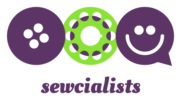
The design uses a button and bobbin to relate to sewing whereas the smiley face speech balloon relates to the social nature of sewcialists.
The button is slightly rotated. It makes it visually more pleasing and reminds us that sewcialists needn’t adhere to the stereotype of off-the-peg garments. The bobbin is half-filled with thread, indicating it’s being used. The friendly chatter that sewcialists engage in online is embodied in the form of a speech balloon/smiley face.
The emblem is simple in its design and its button and bobbin shapes breathe ‘sewing’. The combination of three basic elements makes it memorable, yet distinctive.
The black and white version at the bottom and the color version at the top prove that the logo ‘works’ regardless of colors.
But I don’t like the color!
You don’t have to. You may like the same dress pattern as another sewcialist, but that doesn’t mean you should make it in the same color, right?
The strength of the design is its shape. Only you can choose your prefect colors. So, pick your own colors and make this design your very own sewcialist emblem.
You can do so online at this address:: http://lab.decock.org/sewcialists/
Entry #5- Dylan
Entry #6- Anne- She shares:
My design is a patchwork globe revolving on an axis which is represented by the dress form. The needle and thread which changes to a computer mouse representing the lines of communication going round the globe linking sewing and the social media.
Phew! All this news has worn me out! 
photo credits: google images, all images remain the property of their original creators.


I vote for #5 – simple and direct
LikeLike
I dont know if Im allowed to comment, so please know that I am making a very sage face.
LikeLike
Wow – great entries. I vote for number 6 – Anne. Love it.
LikeLike
This is hard!!!!! I think I’m going to go for #4 – Joost. I don’t like his color choices, but the beauty is in the ability to choose your own colors! Plus I like the simplicity of the design – just enough there to be interesting, but not overwhelming. They’re all good though!
LikeLike
I like #1, #2 and #6. If I can only vote for one it is #6.
LikeLike
#4- Joost
LikeLike
It’s a tough one for me. Between 2 and 3, but I think I’ll have to give Entry #3- Sabina
my vote!
LikeLike
My vote goes to #6 as I love the way it seems to show a unity of sewcialists from around the globe. It’s actually a hard decision as I really like a few of them. Well done to all who contributed and looking forward to seeing which one wins 🙂
LikeLike
#6 by Anne. The others are nice but IMNSHO lacking in warmth, and seem a little sterile.. #6 looks handmade which of course is what we all aspire to with our sewing. It is friendly looking and approachable.The colours are nice as well.
LikeLike
#5- Dylan for me. The stitching that makes up the speech bubble is clever.
LikeLike
I like the last one with the globe, but only in the black and white, it’s too busy with the colors in my opinion.
Gah, I also really like the one with the button, bobbin, and smilie…are you terribly opposed to using more than one? Because I think that in color, this one could be really stunning, but it loses some of its effect when it’s only in B/W (probably because it’s harder to tell what the bobbin is?) (Also, you might change the colors on this one–say a blue button, red thread on a black bobbin, and a yellow smilie, or whatever.)
I’d say make the b/w globe as a “watermark” for the background of the website/whatever you’d want to print, and the bobbin/button logo be the one at the header of the web page…though I guess I’m not entirely sure what you are wanting these for.
LikeLike
My vote is cor design #6 by Anne. I love it!
LikeLike
Sorry, my votes in the proper format are #6 Anne (in b/w) and #4 Joost (in color).
LikeLike
I vote no5 – I think this represents sewing bloggers very well, lots to say and sew!
LikeLike
#4 Joost. I also like #5 but I think #4 works best. The most graphic, easily identifiable one by far.
LikeLike
I like #4! I think #5 would also be good with a tiny bit more tweaking, like more hand-made looking stitches, or two needles as the bubble point, or some color – love the simplicity though 🙂
LikeLike
I LOVE the graphic simplicity of #4 Joost’s logo. And how can you not like the customization option? =) That’s my vote.
(I had fun playing with his graphic using the link – I really like that you can change the colors to match your blog/website.)
LikeLike
#6 Anne – looks handmade, has wit & beautiful message & non-sewists will understand it
LikeLike
no 4 – Joost. I can’t see no 5 – just a cross in a box!
LikeLike
Aargh! Please try one of the other jury blogs- Ill try to fix this!
LikeLike
#6- Anne, I love it and I agree non sewists will understand it too.
LikeLike
I forced myself to scroll through and vote before I looked at any of the other votes. I like #6-Anne the best. Now I’m off to see how everyone else voted.
Happy Sewing!
Beth
LikeLike
I love #1 but I have to vote for #6 because of the words.
LikeLike
#4 Joost
LikeLike
#6 Great job, everyone! Lots to choose from. I liked coutureAnns suggestion, too 🙂
LikeLike
Definitely 3, Sabina.
LikeLike
#4 Joost for me…clean, memorable.
LikeLike
#6 Anne!!!
LikeLike
#3 Sabina! I think it gets the point across very neatly 🙂
LikeLike
I like #3 Sabina, very clean with clearly recognizable components in both B&W and colour (I like it best with the word sewcialist included)
LikeLike
It’s tough but, I vote #4 Joost
LikeLike
I love #2- Gareth!
LikeLike
#4 Joost’s is by far my favourite! Nice and simple, and I love the side-view of the bobbin.
LikeLike
#6 anne, links the social and sewing “world” well together so creative and has lots of detail since its hand drawn! Love it!
LikeLike
anne #6
LikeLike
Anne #6
LikeLike
My favourite has to be #6 Anne!
LikeLike
I vote for #3 Sabina, without the sewcialist name because I dislike the font.
I really like the catch phrase in the last entry though.
LikeLike
I vote for #4 Joost. Love the color generator option!
LikeLike
#3 Sabina…simple, straightforward, easily recognizable
LikeLike
I like them all, it hard to choose, but #1is my fav. The variety of colours of the threads put me in mind of the different people we all are, brought together by a common interest, and look jolly.
LikeLike
Entry #3- Sabina
Sandy in the UK
LikeLike
Entry #4- Joost-
Debbie Eyre
LikeLike
My vote is for Entry #3- Sabina.
LikeLike
My vote is for #4 by Joost. Love the button+bobbin+smiley.
LikeLike
#5 speaks to me.
LikeLike
Voting #4 Joost, cause he knows us girls like to change our minds about colors.
LikeLike
Tough, but I love the customizability of #4 Joost. And it’s the most logo-like to me.
LikeLike
#4 – joost
LikeLike